

Configure the JMeter Aggregate Graph listeners: properties, defaults, and practical usage notes for building reliable load tests.
Part of the Listeners category. Also documented in context in the full Component Reference.
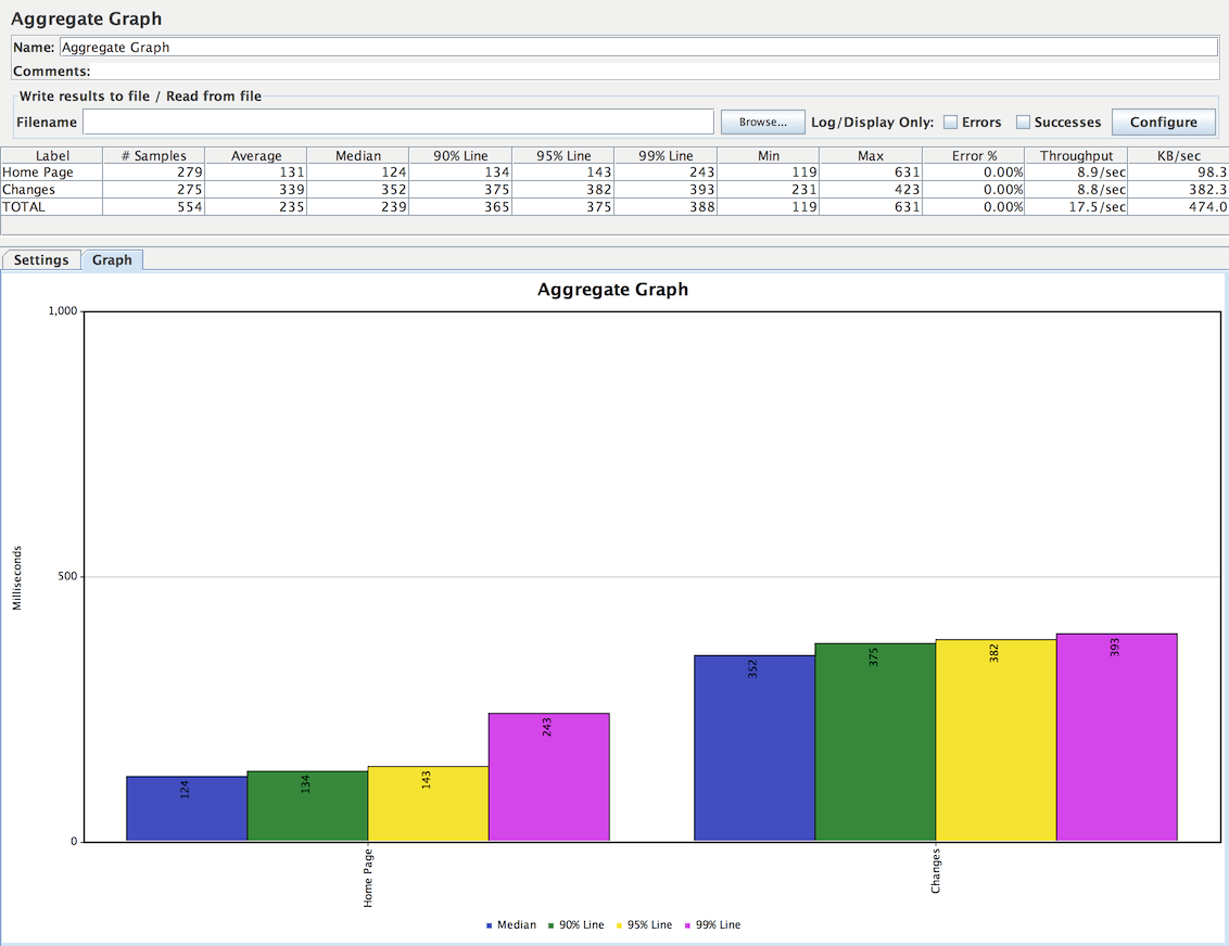
The aggregate graph is similar to the aggregate report. The primary difference is the aggregate graph provides an easy way to generate bar graphs and save the graph as a PNG file.
The figure below shows an example of settings to draw this graph.
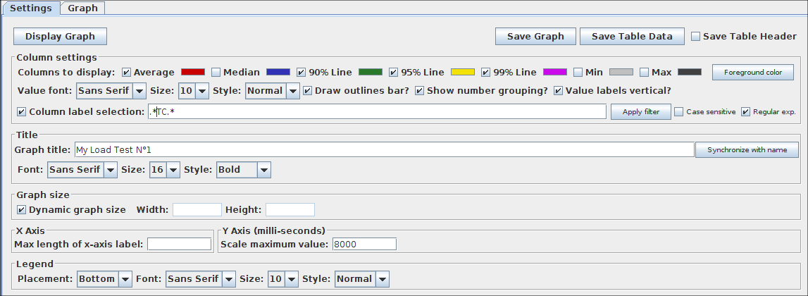 Aggregate graph settings
| Name | Required | Description |
|---|---|---|
| Column settings | Yes | - Columns to display: Choose the column(s) to display in graph. - Rectangles color: Click on right color rectangle open a popup dialog to choose a custom color for column. - Foreground color Allow to change the value text color. - Value font: Allow to define font settings for the text. - Draw outlines bar To draw or not the border line on bar chart - Show number grouping Show or not the number grouping in Y Axis labels. - Value labels vertical Change orientation for value label. (Default is horizontal) - Column label selection: Filter by result label. A regular expression can be used, example: .*Transaction.* Before display the graph, click on Apply filter button to refresh internal data. |
| Title | No | Define the graph’s title on the head of chart. Empty value is the default value: “Aggregate Graph”. The button Synchronize with name define the title with the label of the listener. And define font settings for graph title |
| Graph size | No | Compute the graph size by the width and height depending of the current JMeter’s window size. Use Width and Height fields to define a custom size. The unit is pixel. |
| X Axis settings | No | Define the max length of X Axis label (in pixel). |
| Y Axis settings | No | Define a custom maximum value for Y Axis. |
| Legend | Yes | Define the placement and font settings for chart legend |
Related
Section titled “Related”Was this page helpful?
Thanks for the feedback!Tell us what's missing on GitHub