

Configure the JMeter Graph Results listeners: properties, defaults, and practical usage notes for building reliable load tests.
Part of the Listeners category. Also documented in context in the full Component Reference.
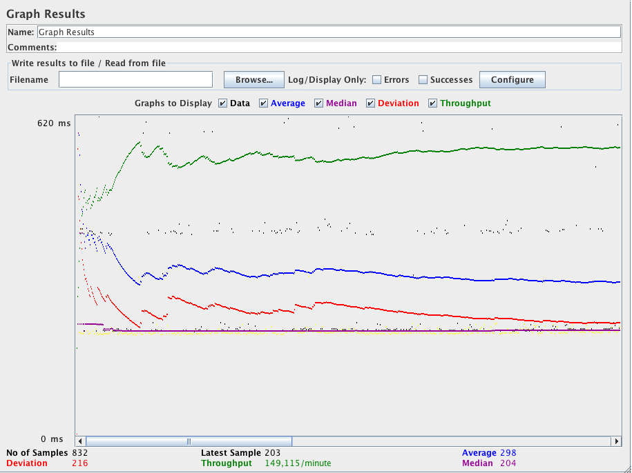
The Graph Results listener generates a simple graph that plots all sample times. Along the bottom of the graph, the current sample (black), the current average of all samples (blue), the current standard deviation (red), and the current throughput rate (green) are displayed in milliseconds.
The throughput number represents the actual number of requests/minute the server handled. This calculation includes any delays you added to your test and JMeter’s own internal processing time. The advantage of doing the calculation like this is that this number represents something real - your server in fact handled that many requests per minute, and you can increase the number of threads and/or decrease the delays to discover your server’s maximum throughput. Whereas if you made calculations that factored out delays and JMeter’s processing, it would be unclear what you could conclude from that number.
The following table briefly describes the items on the graph. Further details on the precise meaning of the statistical terms can be found on the web
-
e.g. Wikipedia - or by consulting a book on statistics.
-
Data- plot the actual data values -
Average- plot the Average -
Median- plot the Median (midway value) -
Deviation- plot the Standard Deviation (a measure of the variation) -
Throughput- plot the number of samples per unit of time
The individual figures at the bottom of the display are the current values.
“Latest Sample” is the current elapsed sample time, shown on the graph as “Data”.
The value displayed on the top left of graph is the max of 90th percentile of response time.